Melhorando a visualização
Carregando as bibliotecas
Cores por continente
gap_07 <- filter(gapminder, year == 2007)
ggplot(gap_07, aes(x = gdpPercap, y = lifeExp,
                   color = continent)) +
  geom_point() +
  theme_minimal()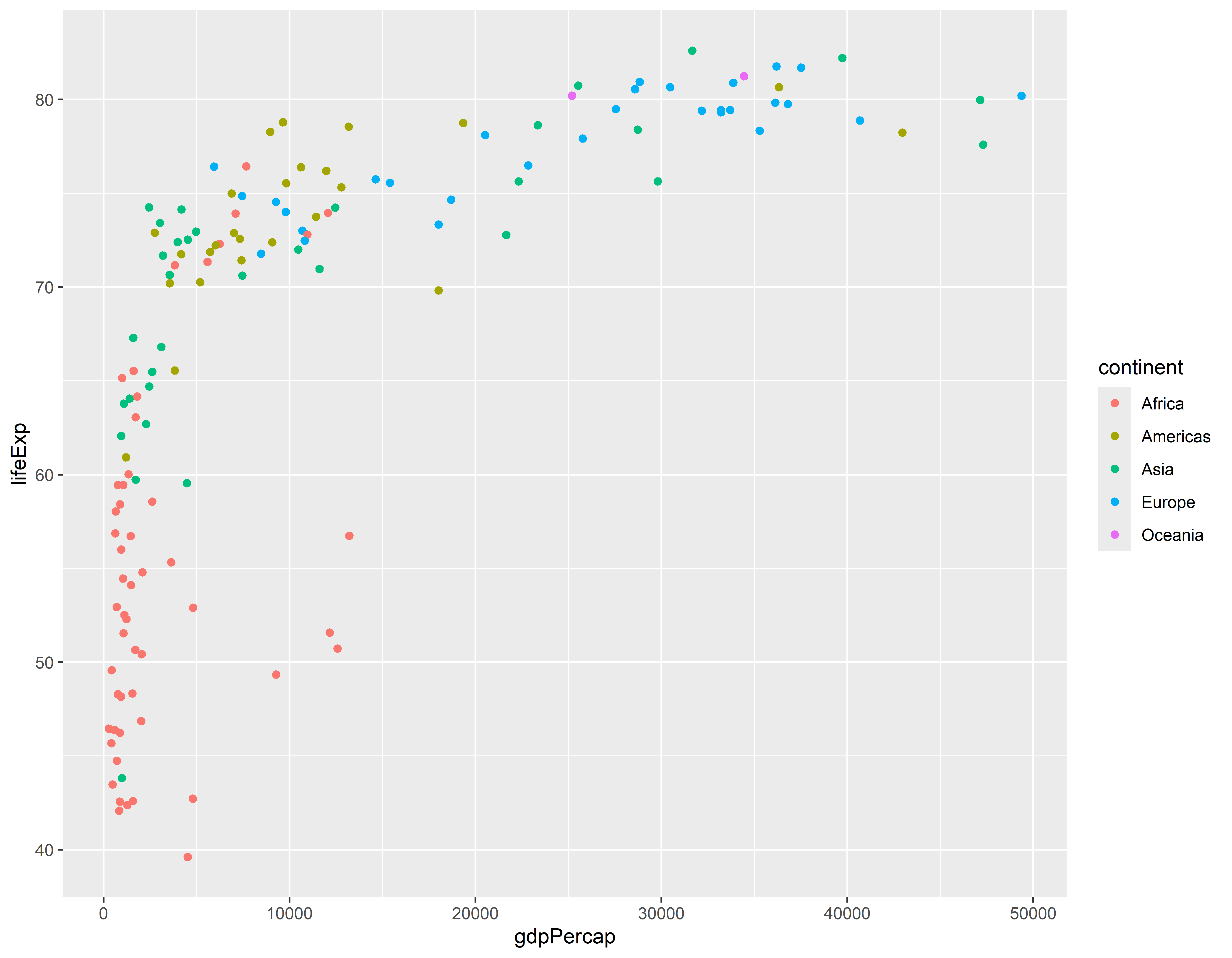
Usando formas e cores diferentes
ggplot(gap_07, aes(x = gdpPercap, y = lifeExp,
                   shape = continent, color = continent)) +
  geom_point() +
  theme_minimal()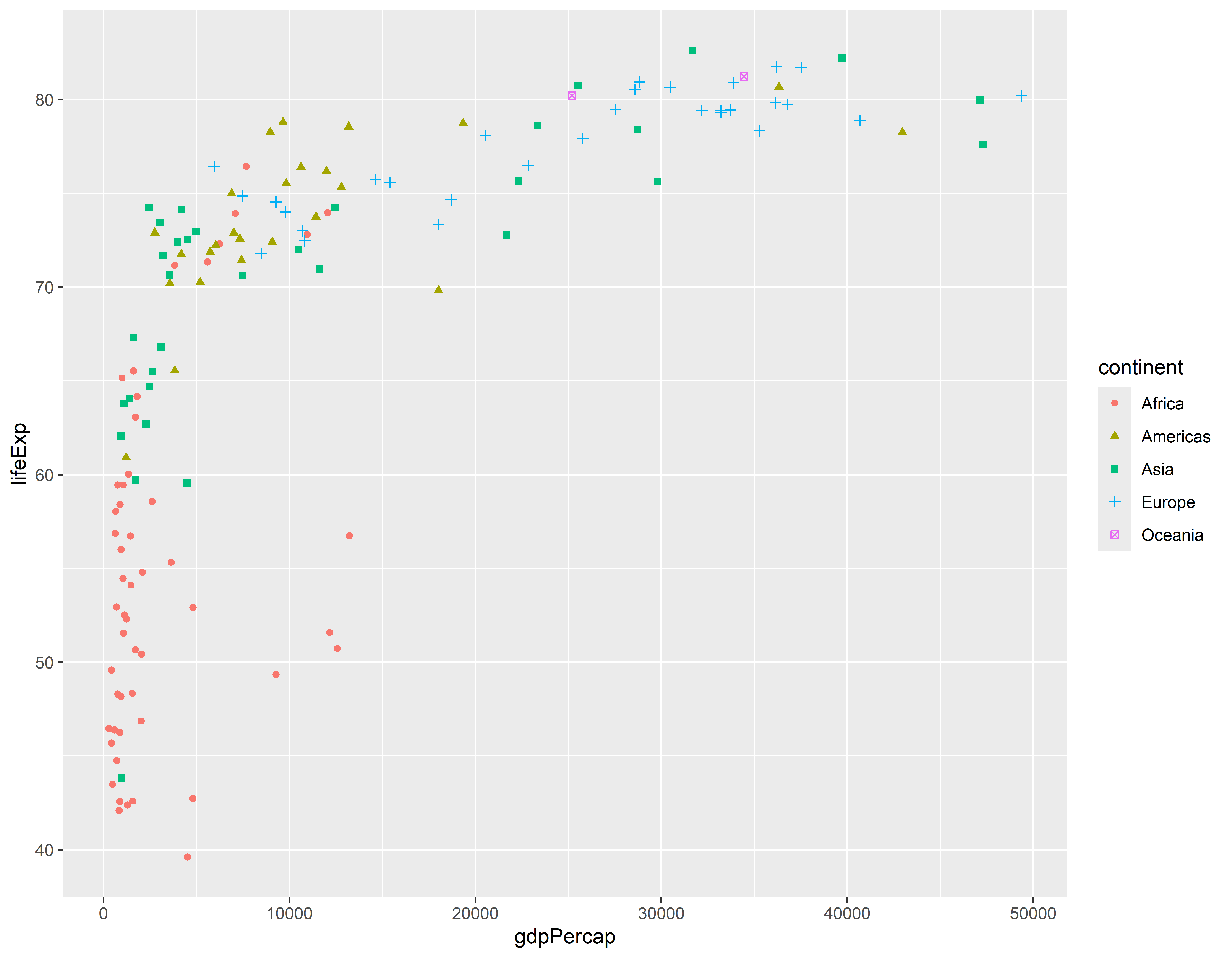
Cores e tamanho
ggplot(gap_07, aes(x = gdpPercap, y = lifeExp,
                   size = pop, color = continent)) +
  geom_point() +
  theme_minimal()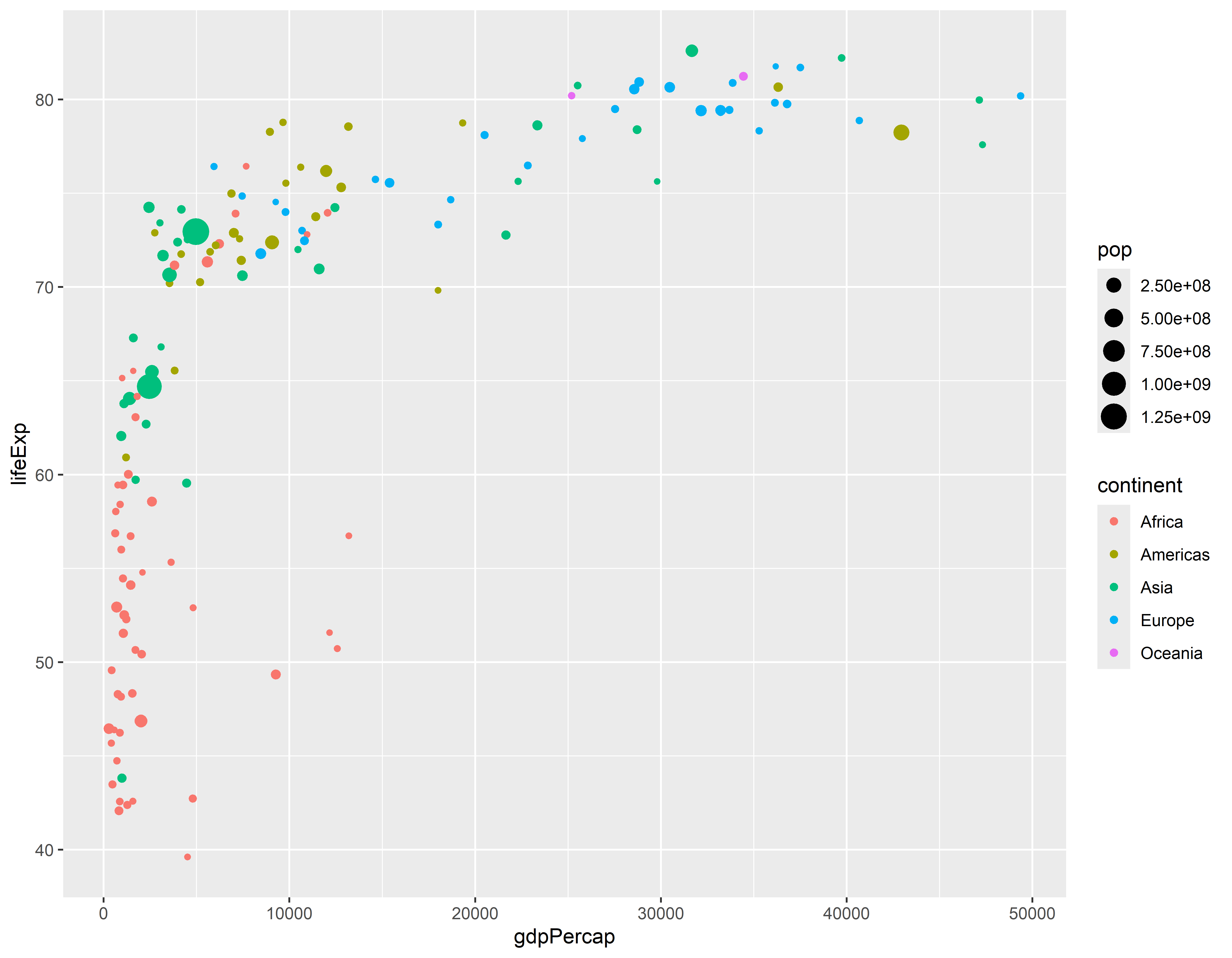
Sumario dos dados para obter pop média por continente
#> `summarise()` has grouped output by 'continent'. You can override using the
#> `.groups` argument.head(gap_pop)#> # A tibble: 6 × 3
#> # Groups: continent [1]
#> continent year pop
#> <fct> <int> <dbl>
#> 1 Africa 1952 4570010.
#> 2 Africa 1957 5093033.
#> 3 Africa 1962 5702247.
#> 4 Africa 1967 6447875.
#> 5 Africa 1972 7305376.
#> 6 Africa 1977 8328097.Grafico de linha com cores
ggplot(gap_pop, aes(x = year, y = pop, color = continent)) +
  geom_line() +
  geom_point() +
  theme_minimal()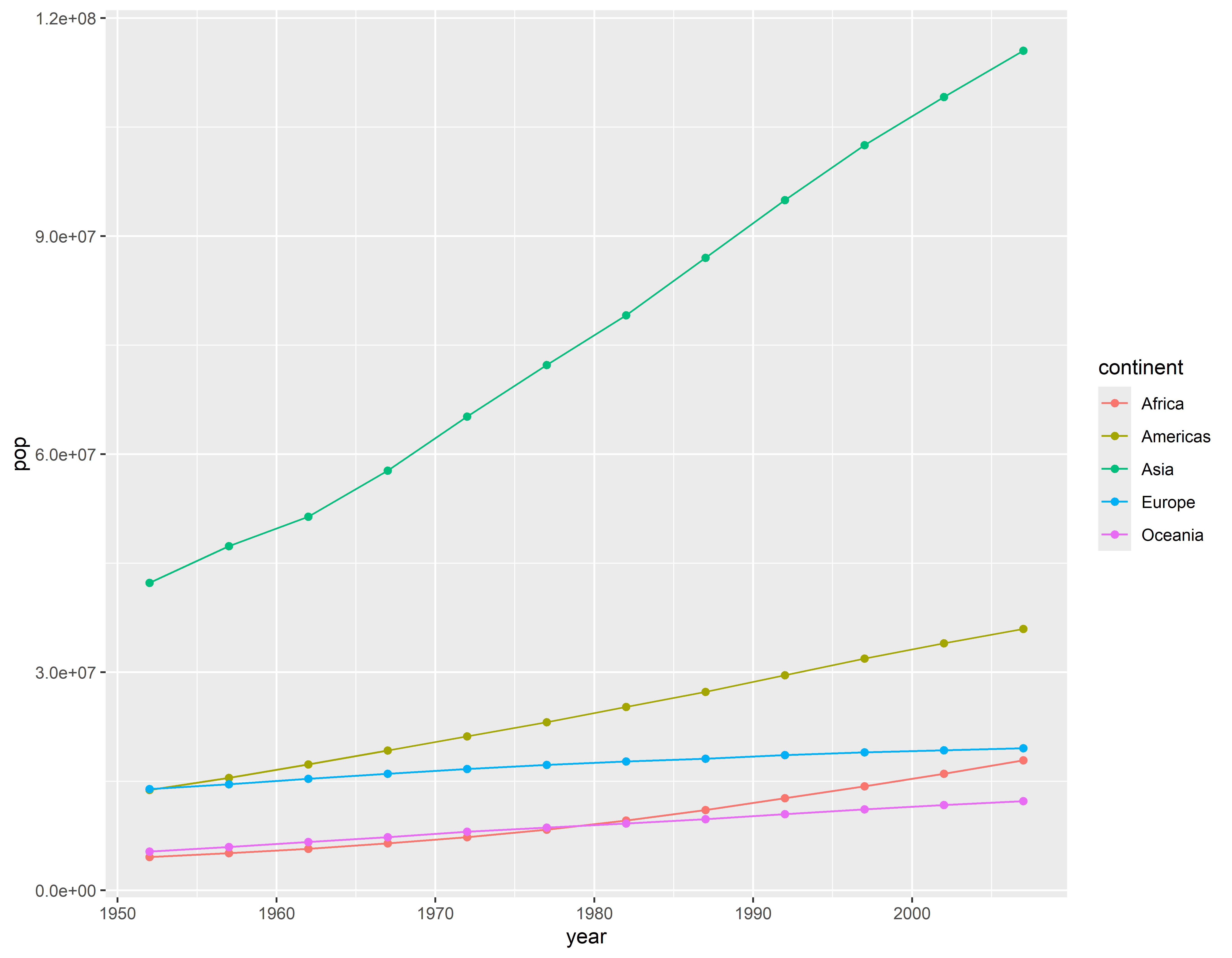
Criando grids entre os anos de 2002 e 2007
gap_0207 <- gapminder %>% filter(between(year, 2002, 2007))
ggplot(gap_0207, aes(x = gdpPercap, y = lifeExp)) +
  geom_point() +
  facet_grid(continent ~ year) +
  theme_minimal()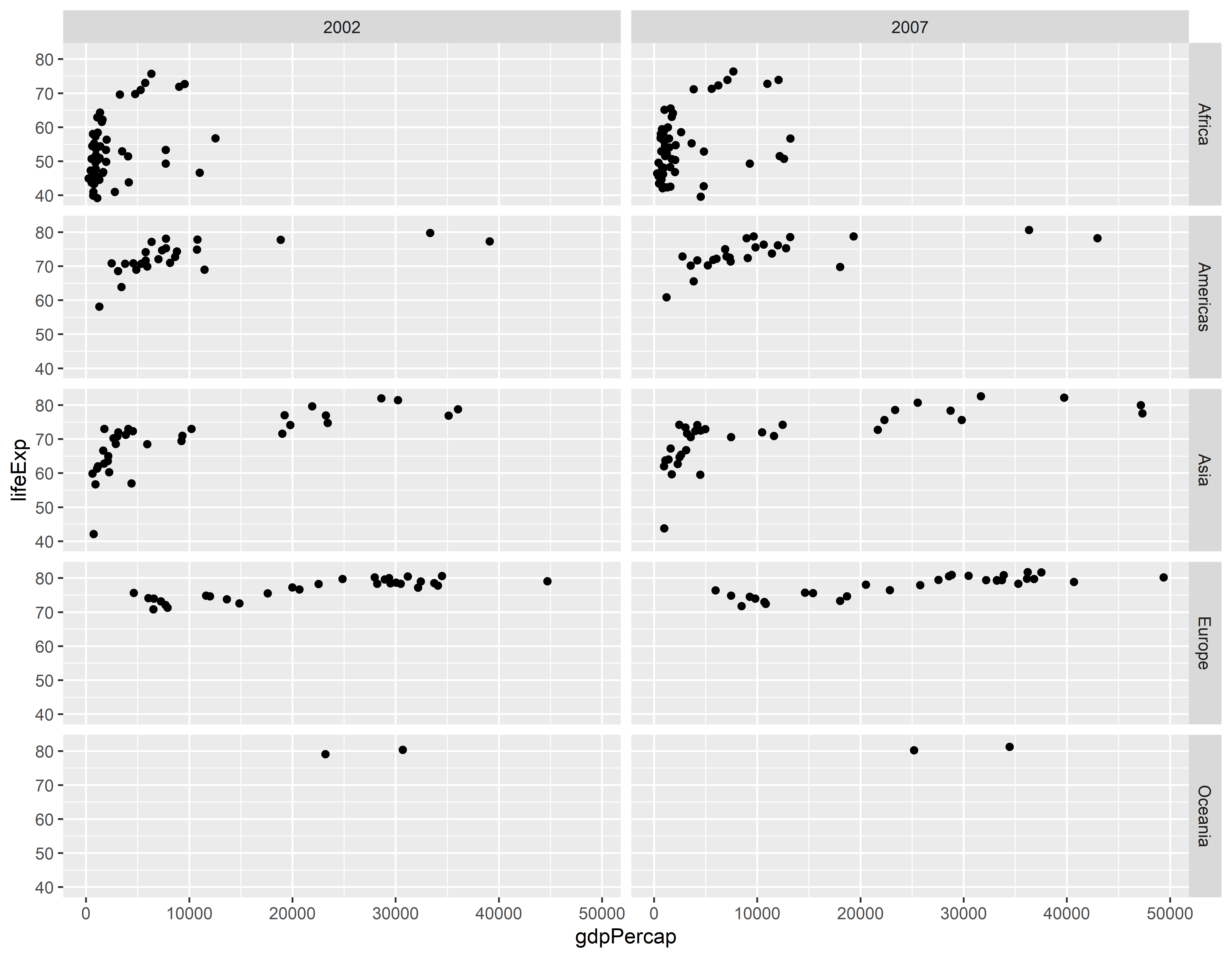
Outro tipo de apresentações de grid
#> `summarise()` has grouped output by 'continent'. You can override using the
#> `.groups` argument.ggplot(gap_life, aes(x = year, y = lifeExp)) +
geom_line() +
facet_grid(continent ~ .) +
theme_minimal()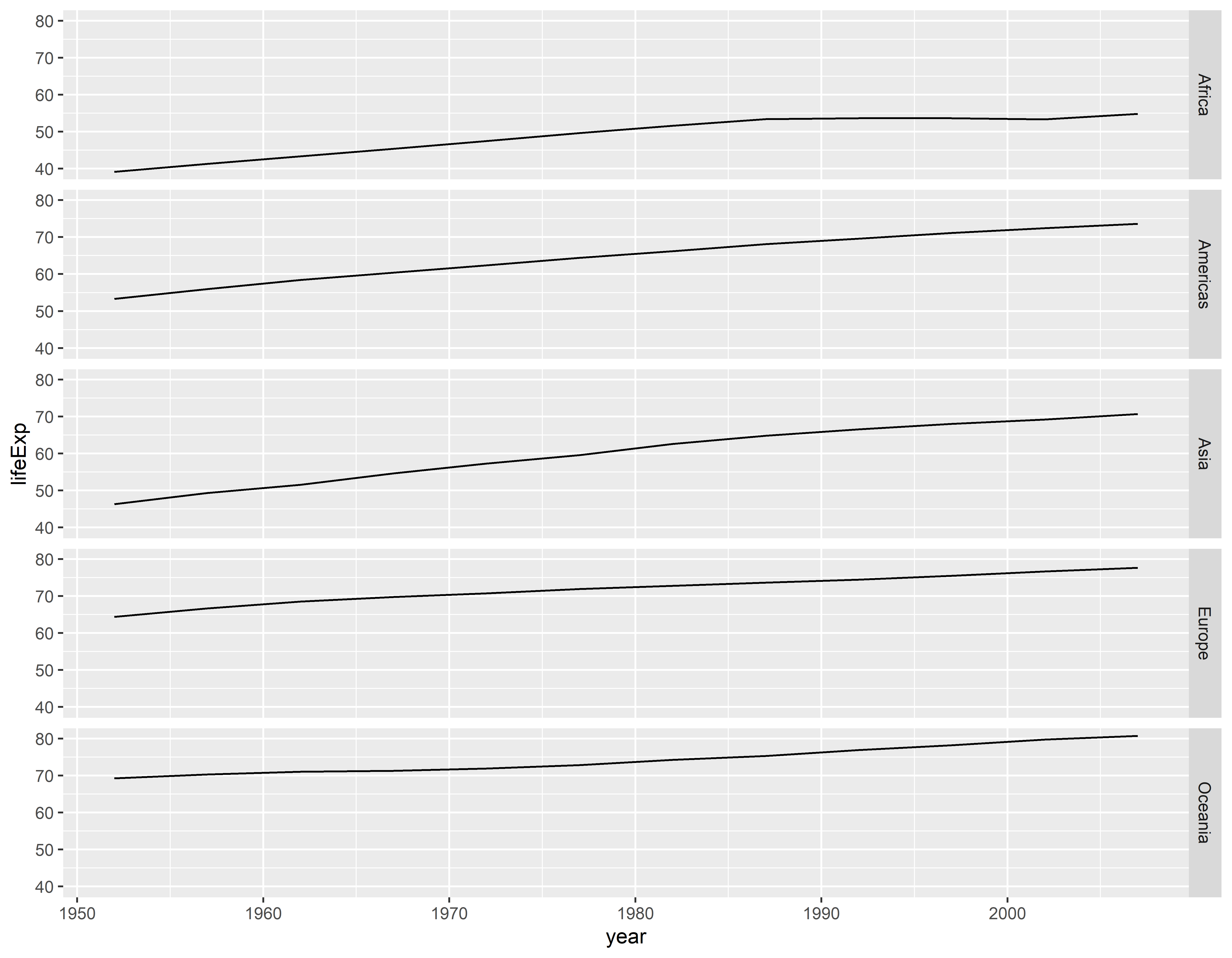
Grid em outra direção
ggplot(gap_life, aes(x = year, y = lifeExp)) +
  geom_line() +
  facet_grid(. ~ continent) +
  theme_minimal()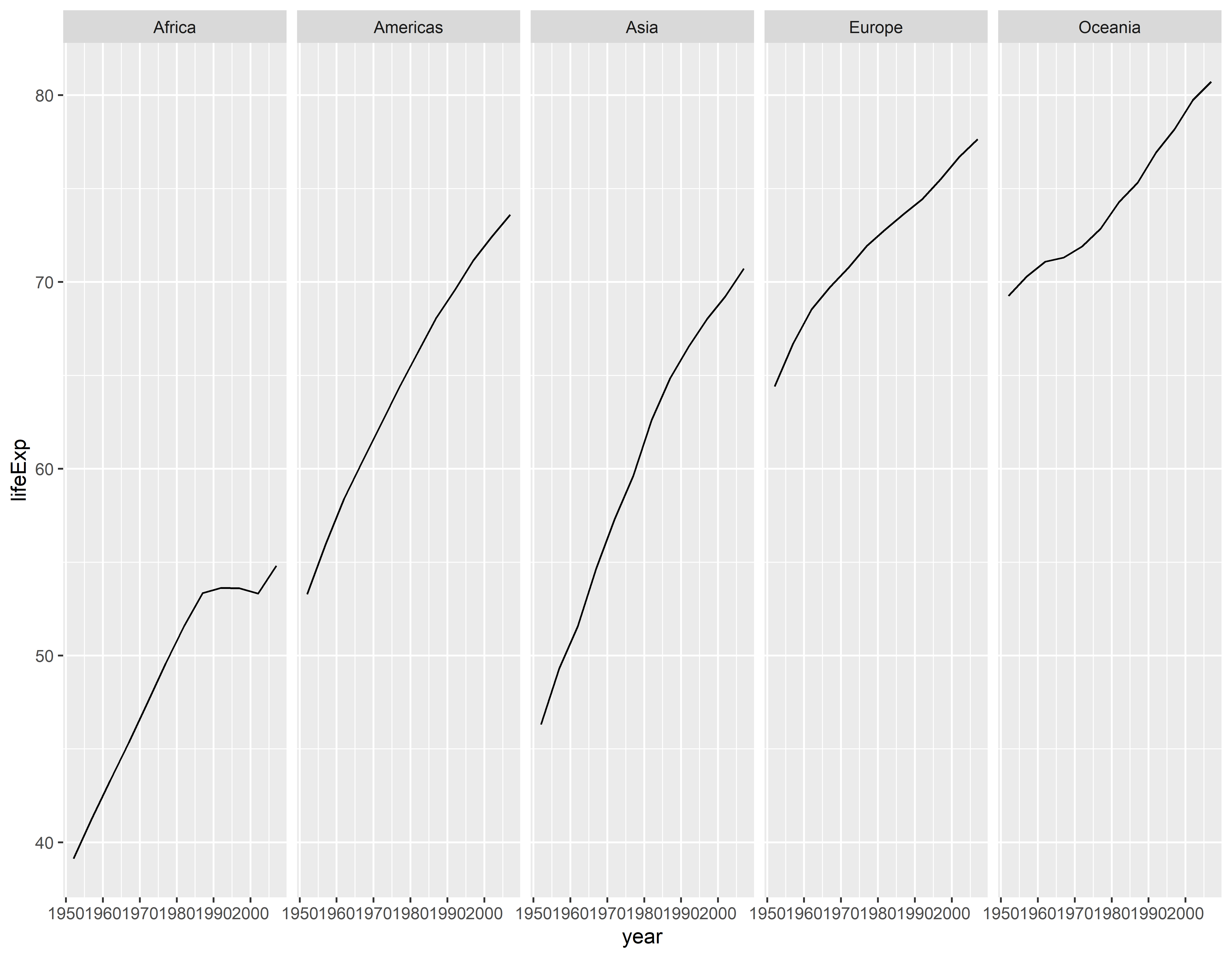
Usando o wrap
ggplot(gap_life, aes(x = year, y = lifeExp)) +
  geom_line() +
  facet_wrap( ~ continent) +
  theme_minimal()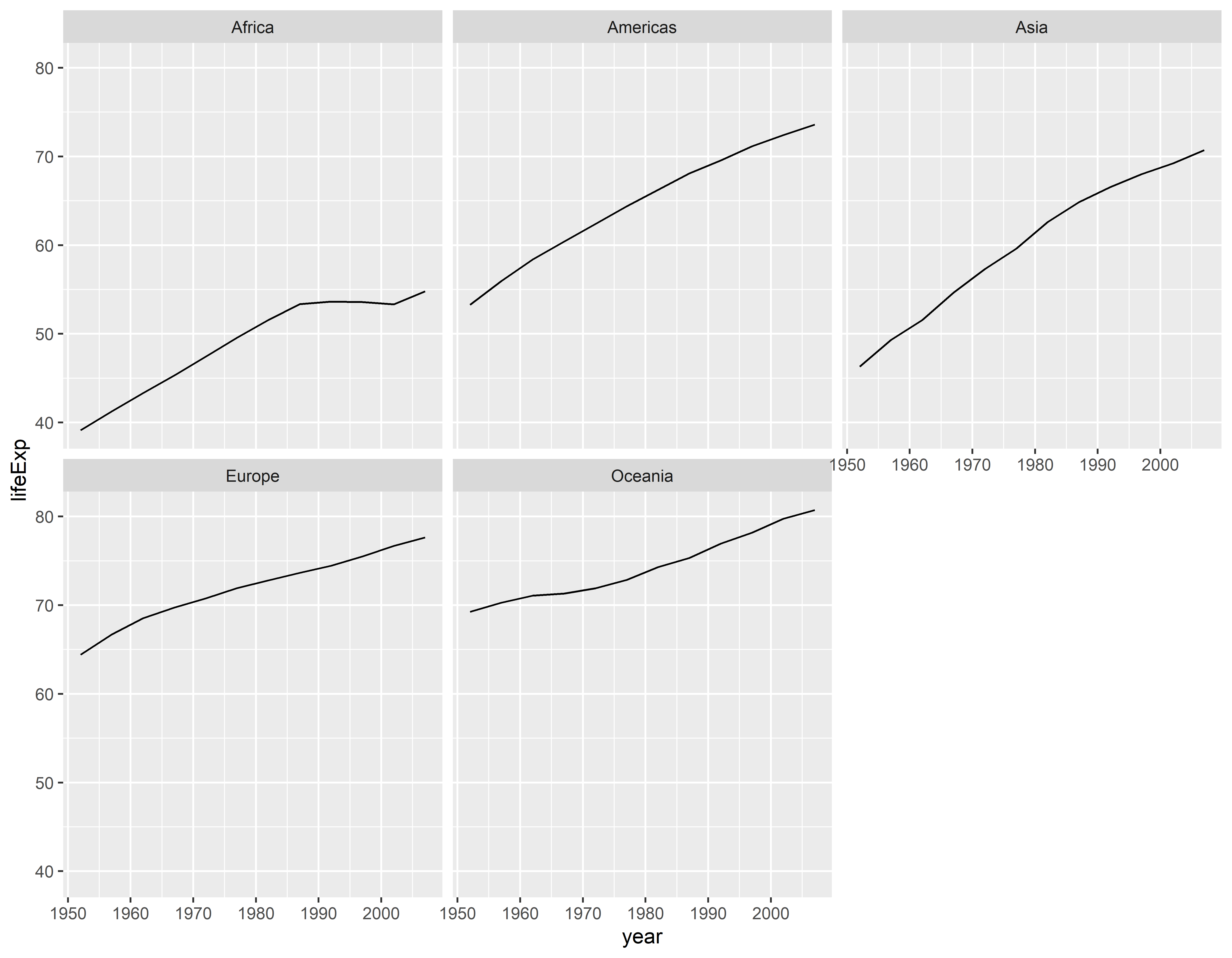
Filtrando dados e fazendo grafico de dispersão padrão
gapminder |>
  filter(year == 2007) |>
  ggplot(aes(x = gdpPercap, y = lifeExp)) +
  geom_point() +
  theme_minimal()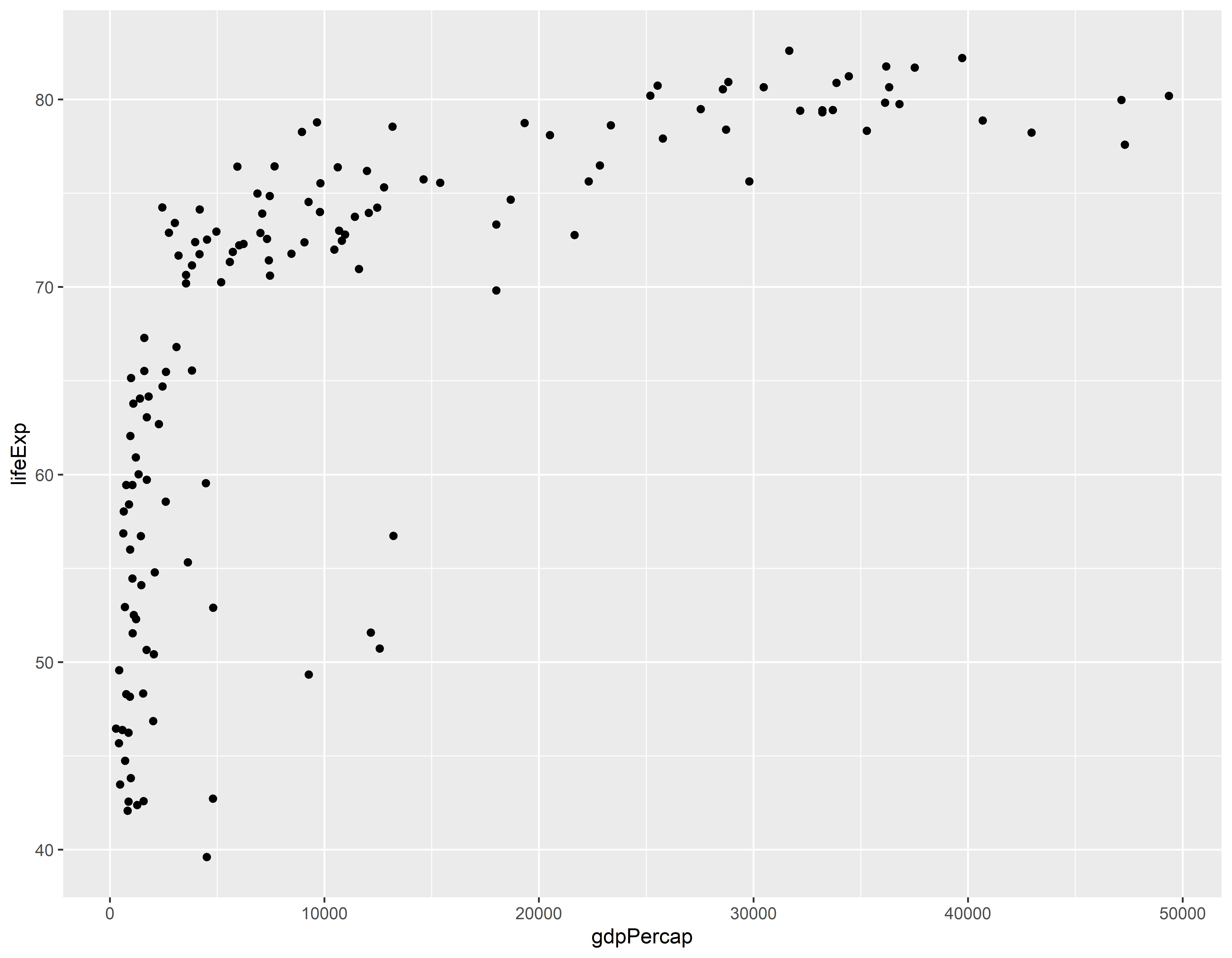
Transformando o eixo x para escala logarítimica
gapminder |>
  filter(year == 2007) |>
  ggplot(aes(x = gdpPercap, y = lifeExp)) +
  geom_point() +
  scale_x_continuous(trans = "log10") +
  theme_minimal()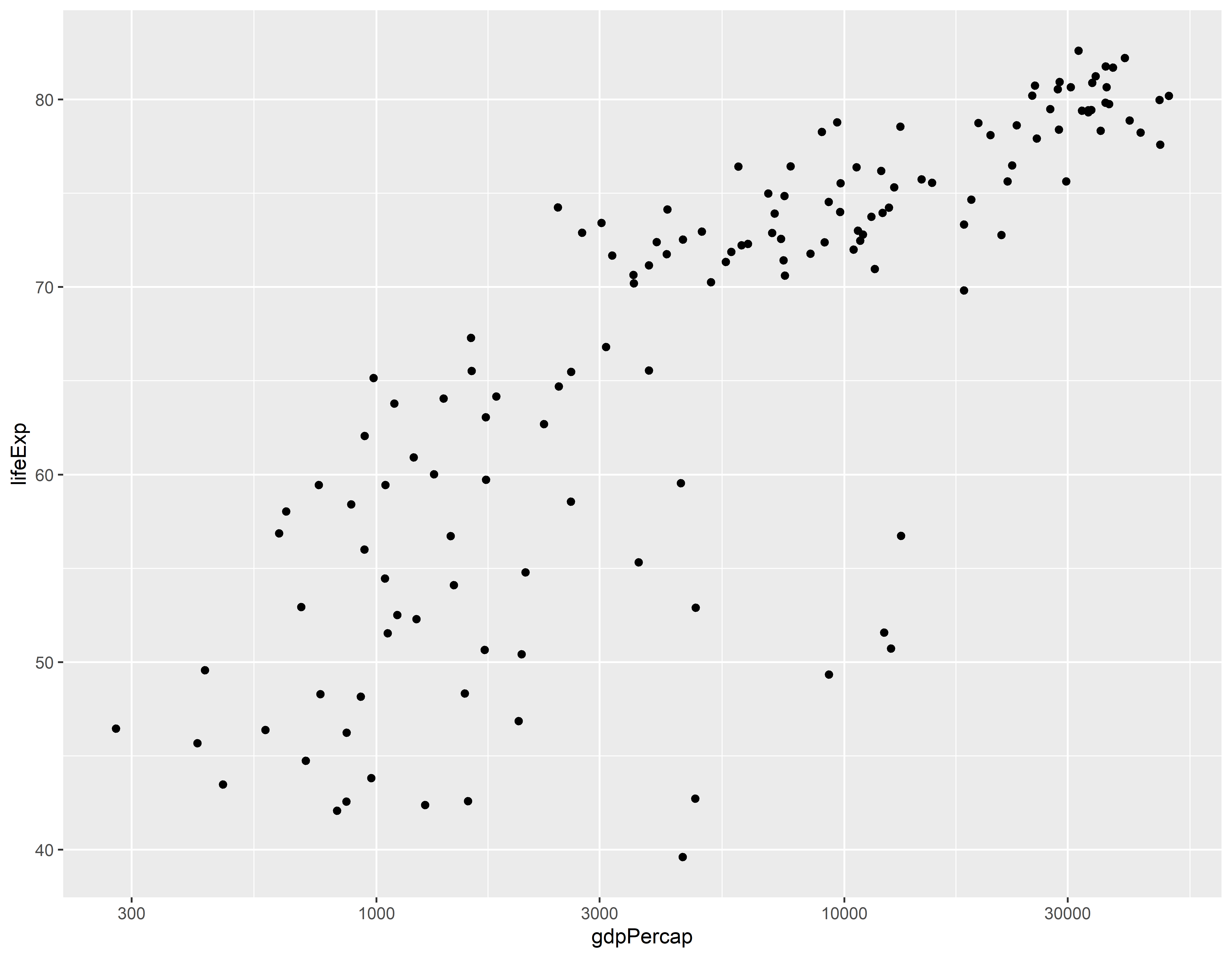
Outra forma de transformação do eixo x
gapminder |>
  filter(year == 2007) |>
  ggplot(aes(x = gdpPercap, y = lifeExp)) +
  geom_point() +
  scale_x_log10() +
  theme_minimal()
Definindo limites para o eixo y
gapminder |>
  filter(year == 2007) |>
  ggplot(aes(x = gdpPercap, y = lifeExp)) +
  geom_point() +
  scale_x_log10() +
  scale_y_continuous(limits = c(0, 95)) +
  theme_minimal()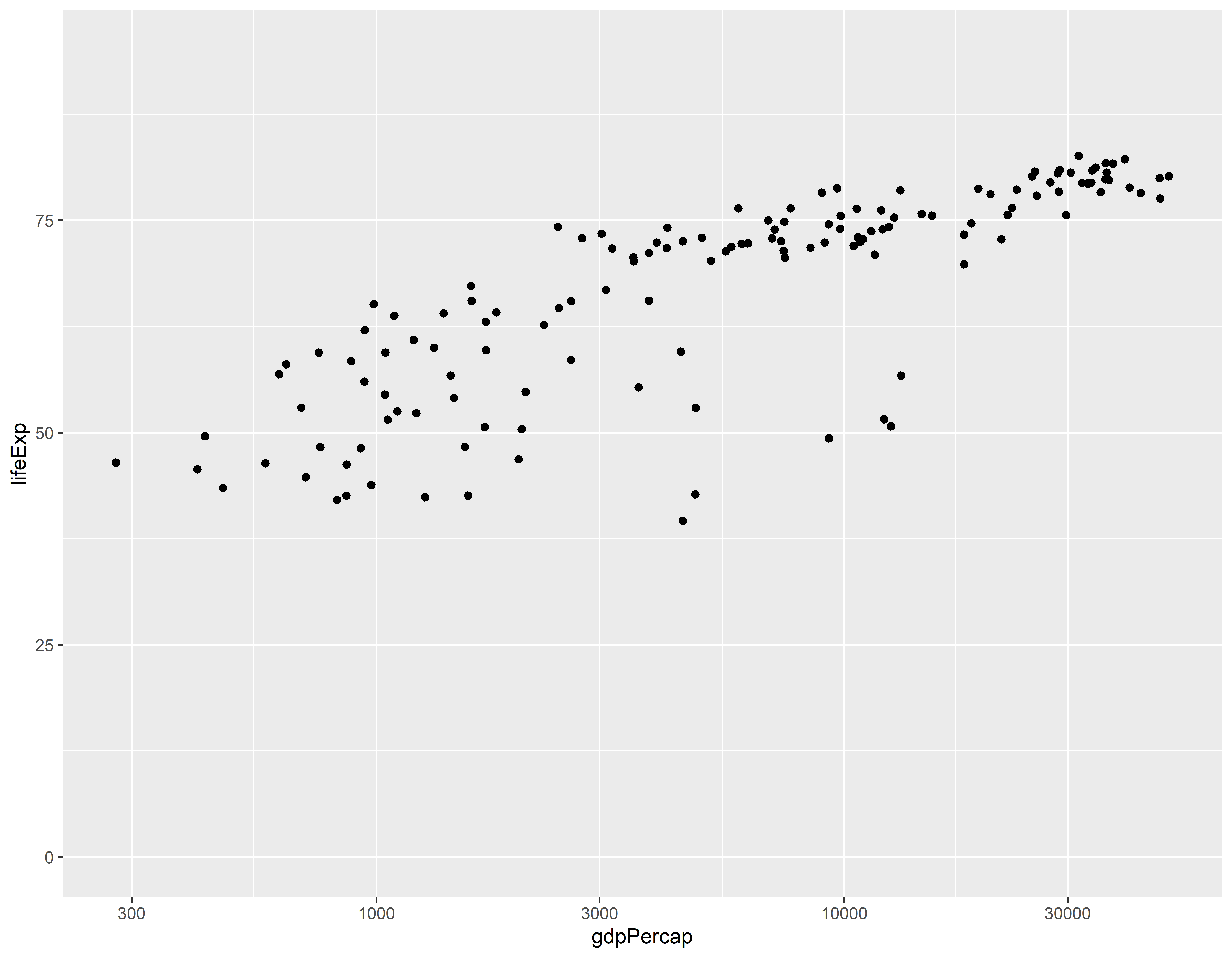
Grafico com cores normais
gap_07 <- gapminder |> filter(year == 2007)
ggplot(gap_07, aes(x = gdpPercap, y = lifeExp, color = continent)) +
  geom_point() +
  scale_x_log10() +
  theme_minimal()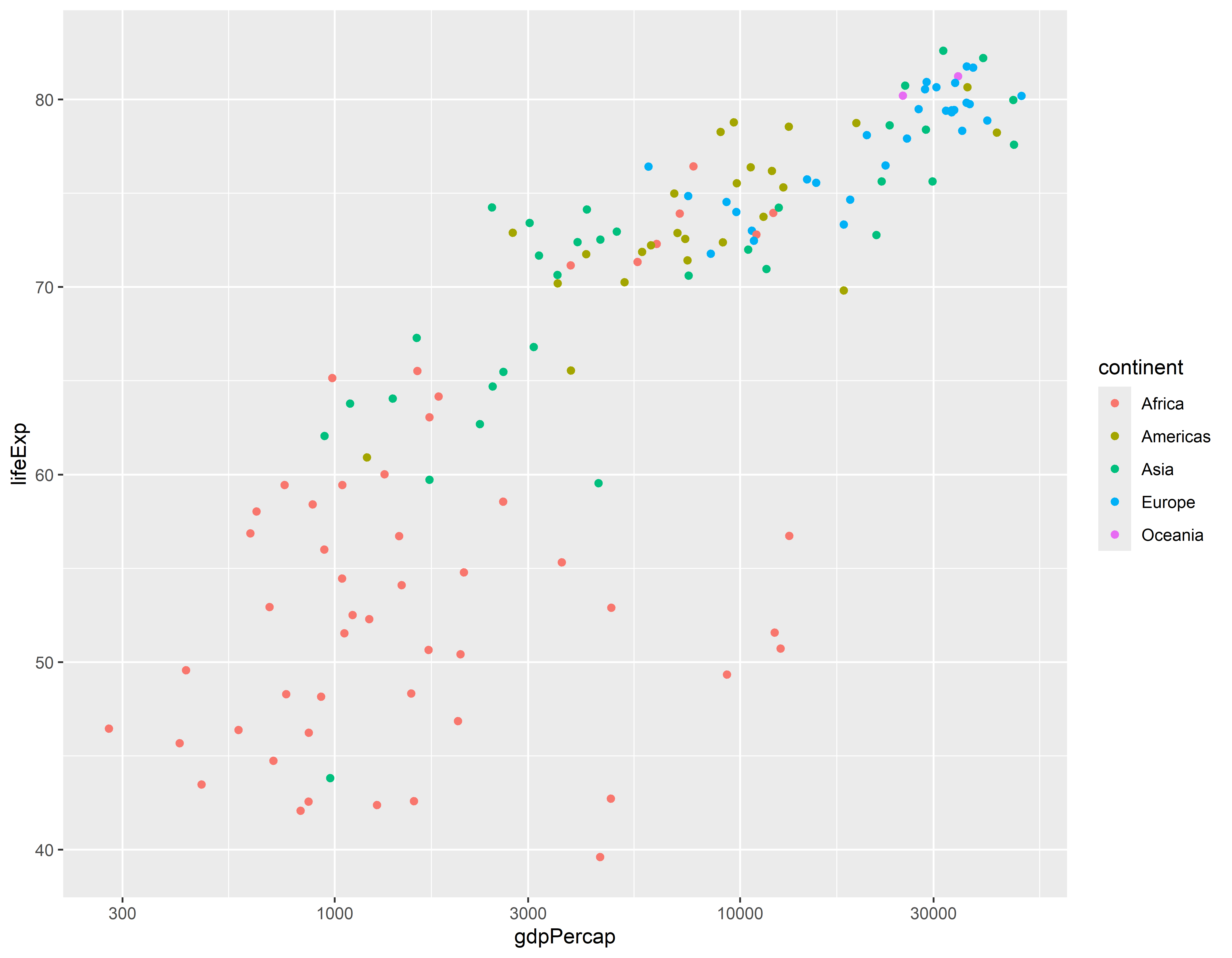
Grafico usando outra paleta de cores
ggplot(gap_07, aes(x = gdpPercap, y = lifeExp, color = continent)) +
  geom_point() +
  scale_x_log10() +
  scale_color_brewer(palette = "Dark2")  +
  theme_minimal()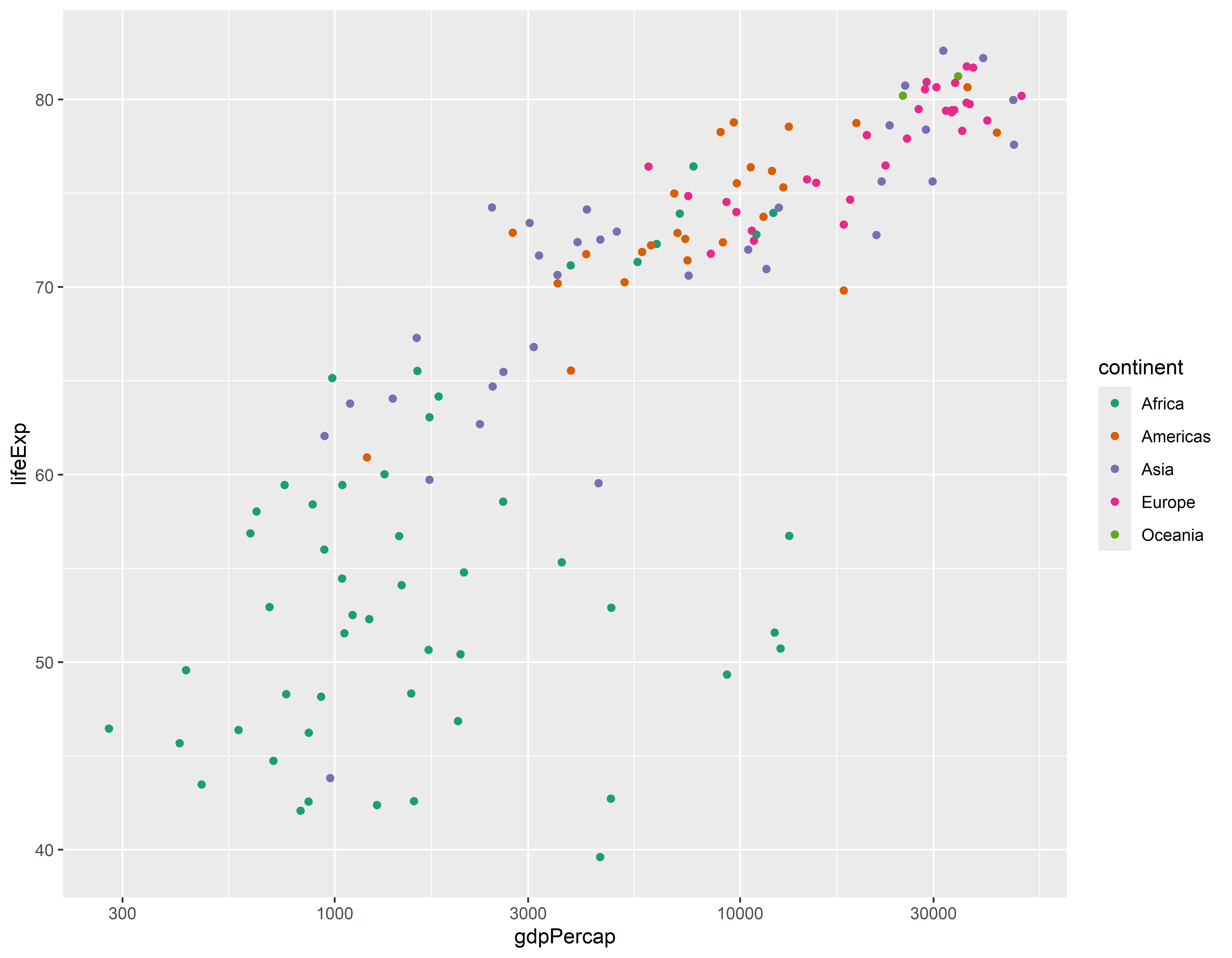
Usando codigos manuais para as cores
ggplot(gap_07, aes(x = gdpPercap, y = lifeExp, color = continent)) +
  geom_point() +
  scale_x_log10() +
  scale_color_manual(values = c("#FF0000", "#00A08A", "#F2AD00",
                                "#F98400", "#5BBCD6"))  +
  theme_minimal()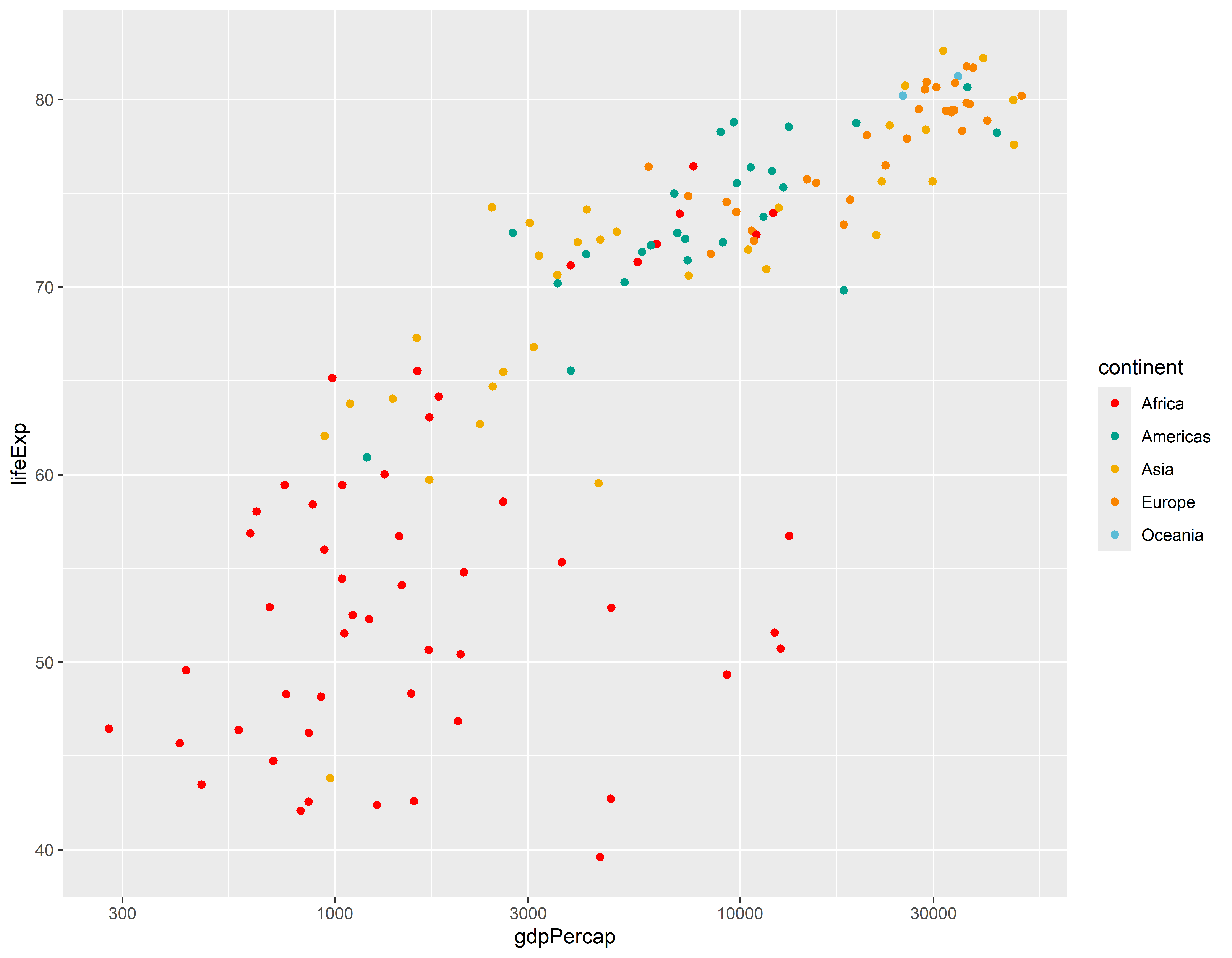
Definindo as cores e tamanho dos pontos
ggplot(gap_07, aes(x = gdpPercap, y = lifeExp)) +
  geom_point(color = "darkblue", size = 3) +
  scale_x_log10()  +
  theme_minimal()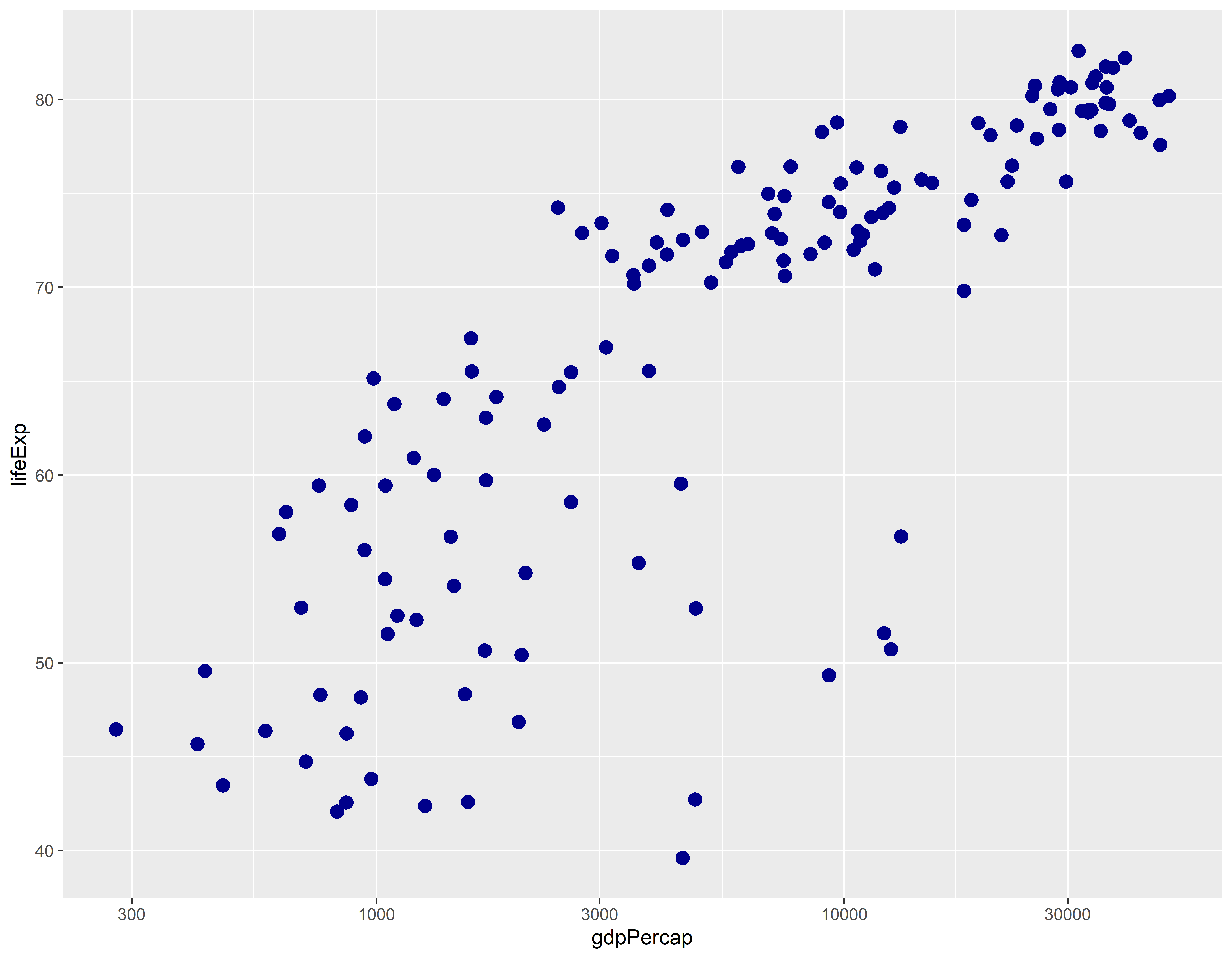
Customizando títulos, rótulos de eixo e legendas
ggplot(gap_07, aes(x = gdpPercap, y = lifeExp, color = continent)) +
  geom_point(size = 2) +
  scale_x_log10() +
  theme_minimal() +
  theme(legend.position = "bottom")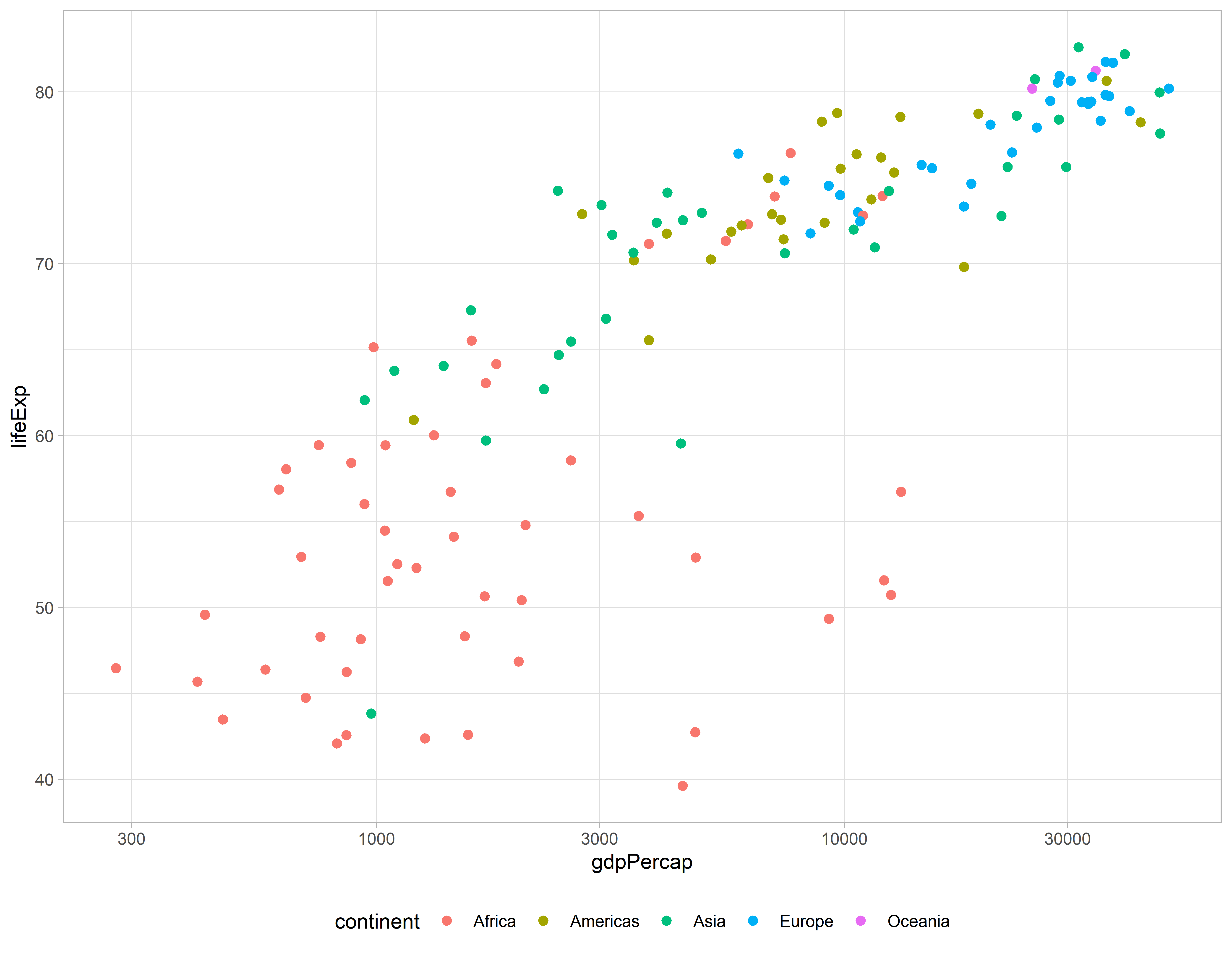
Sem legenda
ggplot(gap_07, aes(x = gdpPercap, y = lifeExp, color = continent)) +
  geom_point(size = 2) +
  scale_x_log10() +
  theme_minimal() +
  theme(legend.position = "none")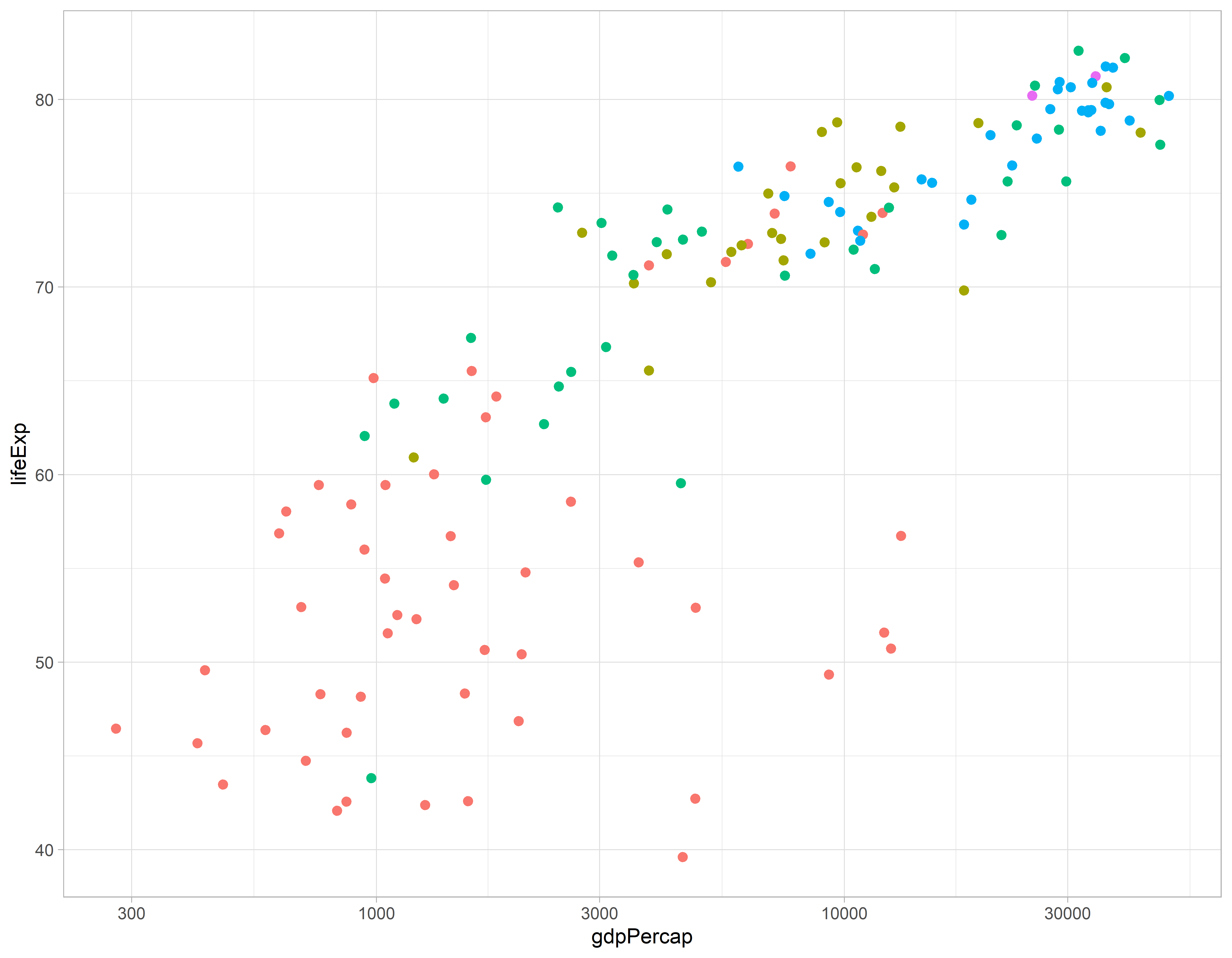
Salvando o gráfico
graf1 <- ggplot(gap_07, aes(x = gdpPercap, y = lifeExp, color = continent)) +
  geom_point(size = 2) +
  scale_x_log10() +
  theme_light()

graf1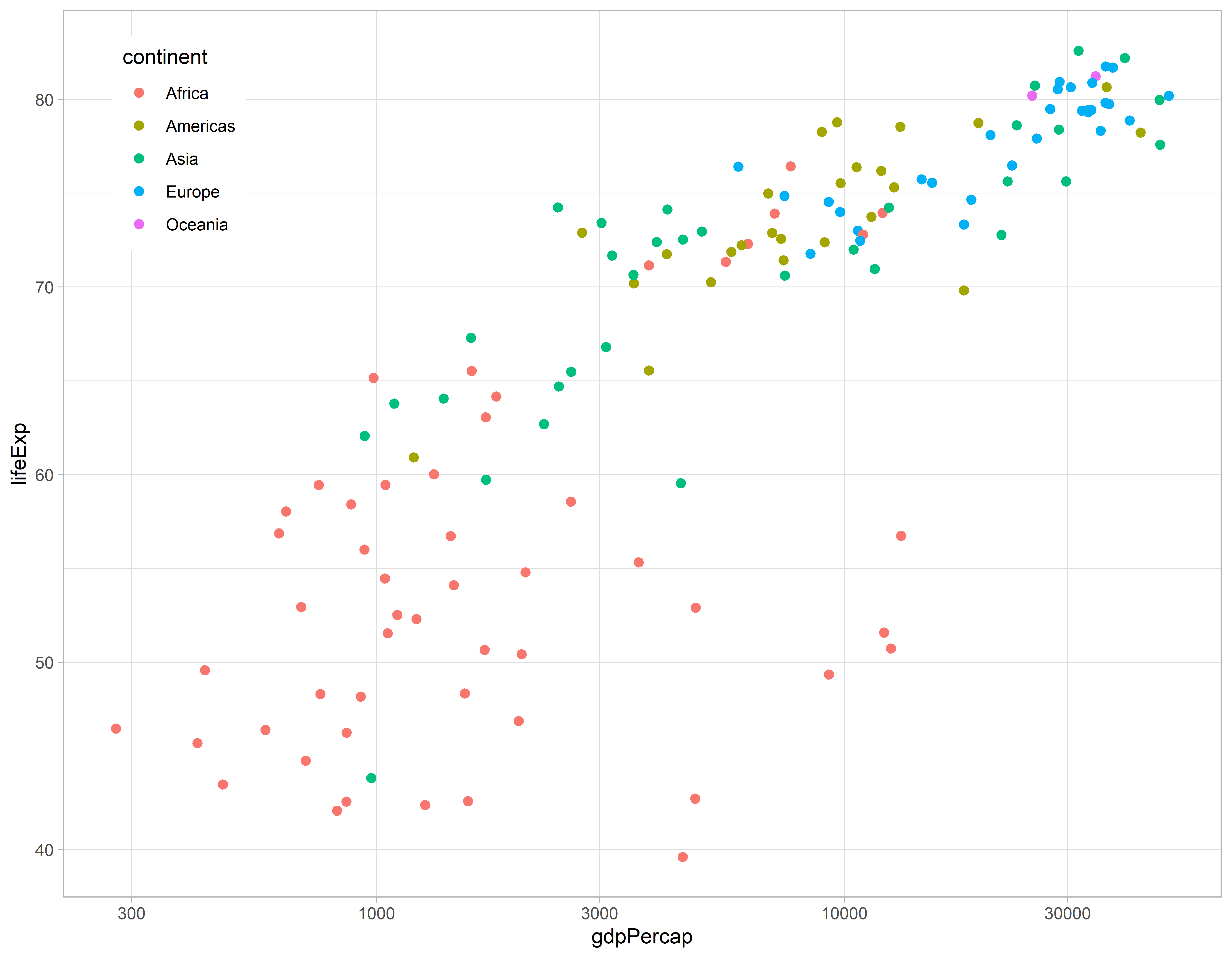
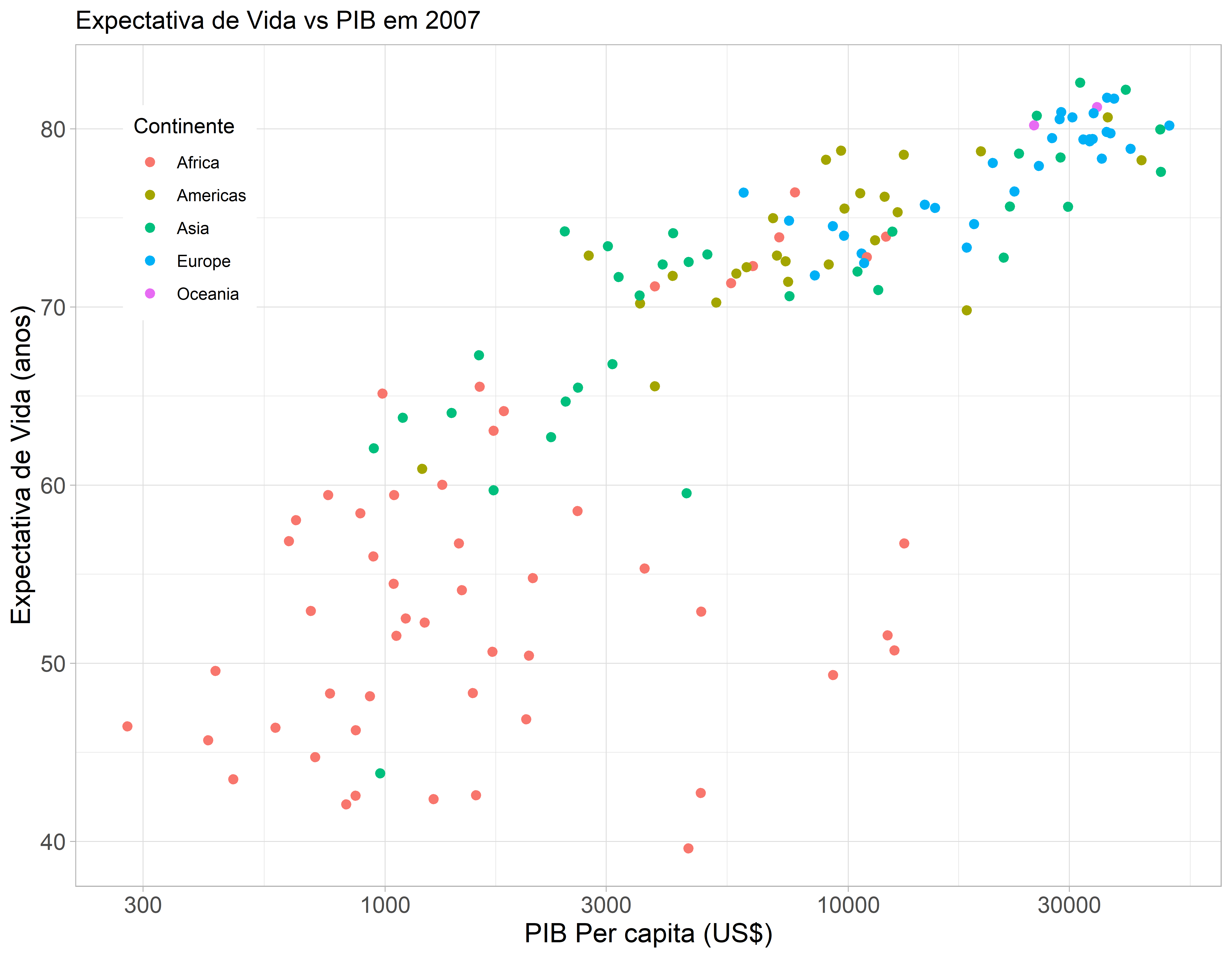
Aumentando o tamanho do texto e mudando para portugues
graf2 <- ggplot(gap_07, aes(x = gdpPercap, y = lifeExp, color = continent)) +
  geom_point(size = 2) +
  scale_x_log10() +
  theme_light() +
  theme(legend.key = element_blank(),
        axis.text = element_text(size = 12),
        axis.title = element_text(size = 14)) +
  labs(x = "PIB Per capita (US$)",
       y = "Expectativa de Vida (anos)",
       title = "Expectativa de Vida vs PIB em 2007",
       color = "Continente")

graf2